Johnson & Johnson
Johnson & Johnson
MEDTech - Depuy Synthesis
MEDTech - Depuy
Year
2024
Tangram seeks to offer an end-to-end virtual planning system for facial reconstruction.
it helps surgeons order customisable products for their patients to perform a specific surgical procedure
Tangram seeks to offer an end-to-end virtual planning system for facial reconstruction.
The Problem
Surgeons in facial reconstruction need a streamlined way to plan and order customised implants.Tangram addresses this by offering an integrated virtual platform for precise, end-to-end surgical planning and product customisation.
The Solution
The solution I came up with multiple solutions for specific features, I iterated and created variants for Tangram’s platform, developed intuitive intake flows, designed the UI, and conducted usability testing.
My Responsibility
I was responsible for devising and iterating solutions for key features, designing intuitive UI, and developing prototypes. This included conducting extensive usability testing to refine the platform and ensure an optimal user experience.





Tangram seeks to offer an end-to-end virtual planning system for facial reconstruction.
In simple words, it helps surgeons order customisable products for their patients to perform a specific surgical procedure
Tangram seeks to offer an end-to-end virtual planning system for facial reconstruction.
In simple words, it helps surgeons order customisable products for their patients to perform a specific surgical procedure
Tangram seeks to offer an end-to-end virtual planning system for facial reconstruction.
In simple words, it helps surgeons order.
Divide and conquer
Divide and
conquer
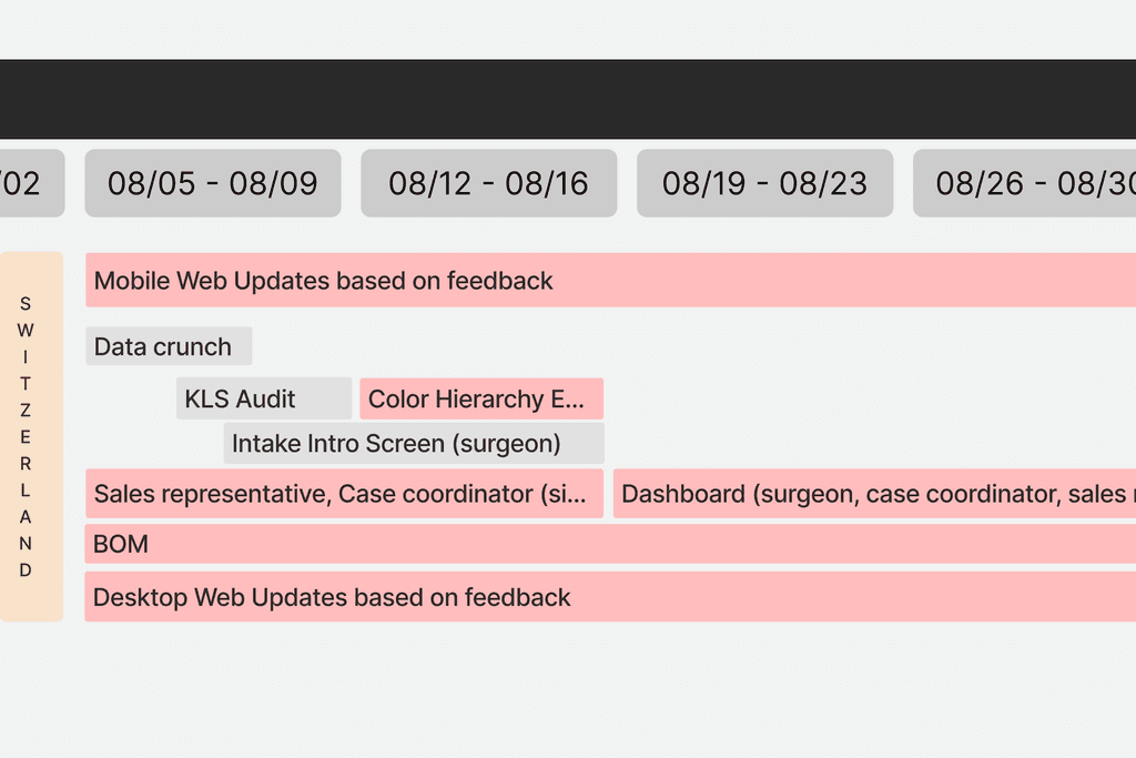
As part of a team of four, we decided to divide and conquer. My role was to weave together the finer details, focusing on mobile web updates, refining color hierarchies, and ensuring every interaction felt intuitive. Tasked with handling the UX side of things, I worked closely with the team to create a seamless flow from concept to final execution.
As part of a team of four, we decided to divide and conquer. My role was to weave together the finer details, focusing on mobile web updates, refining color hierarchies, and ensuring every interaction felt intuitive.
Problem Faced
Problem Faced
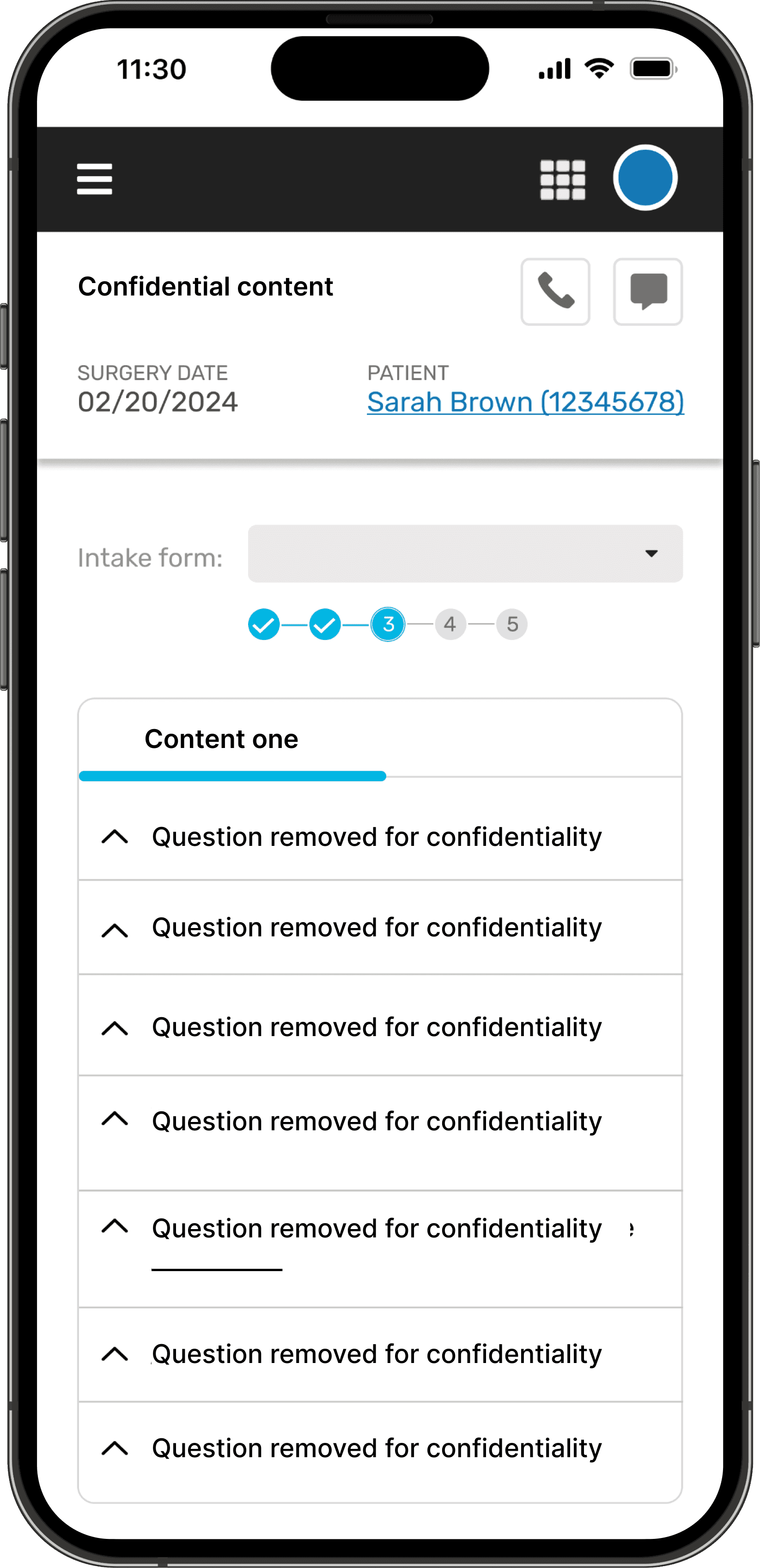
My tasks were mostly based on finding design solutions for specific features in a unique experience.
Challenges:
Jump into a new product, understand how it works with it’s respective target audience
Making sure the solutions match the existing design system and limitations
Integrating interaction through figma’s prototyping
My tasks were mostly based on finding design solutions for specific features in a unique experience.
Challenges:
Jump into a new product, understand how it works with it’s respective target audience
Making sure the solutions match the existing design system and limitations
Integrating interaction through figma’s prototyping
Solutions Proposed
Solutions Proposed
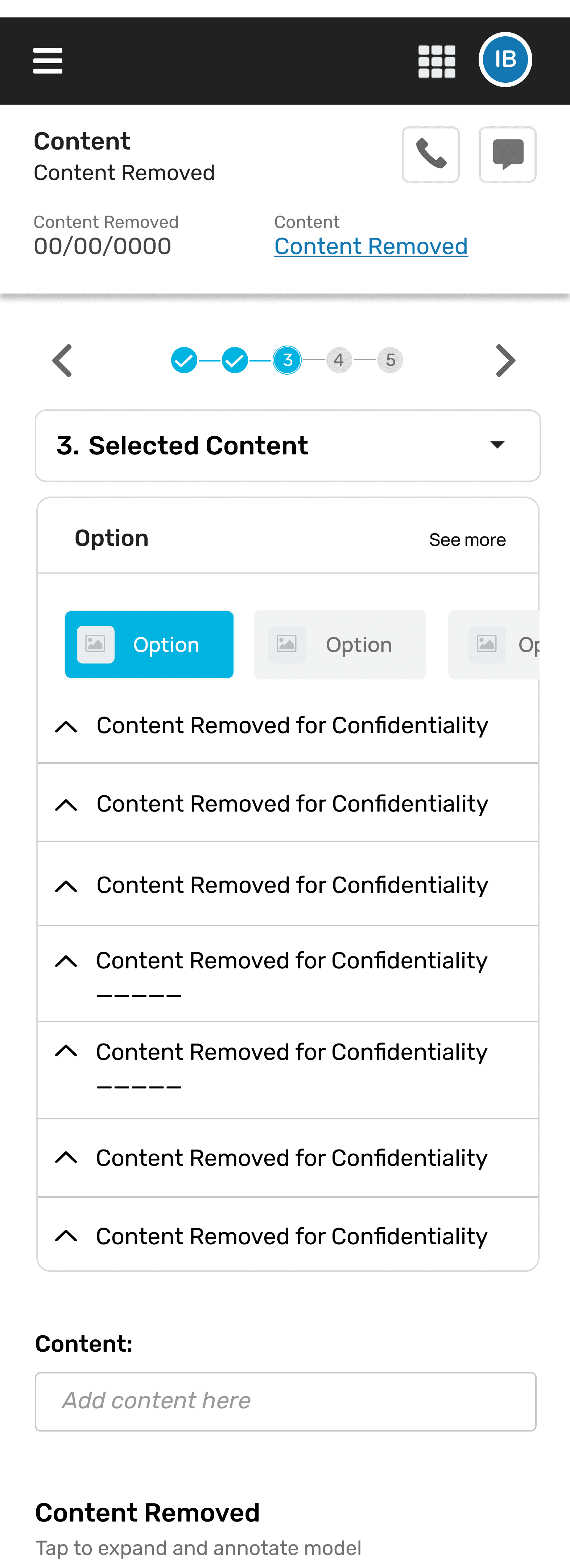
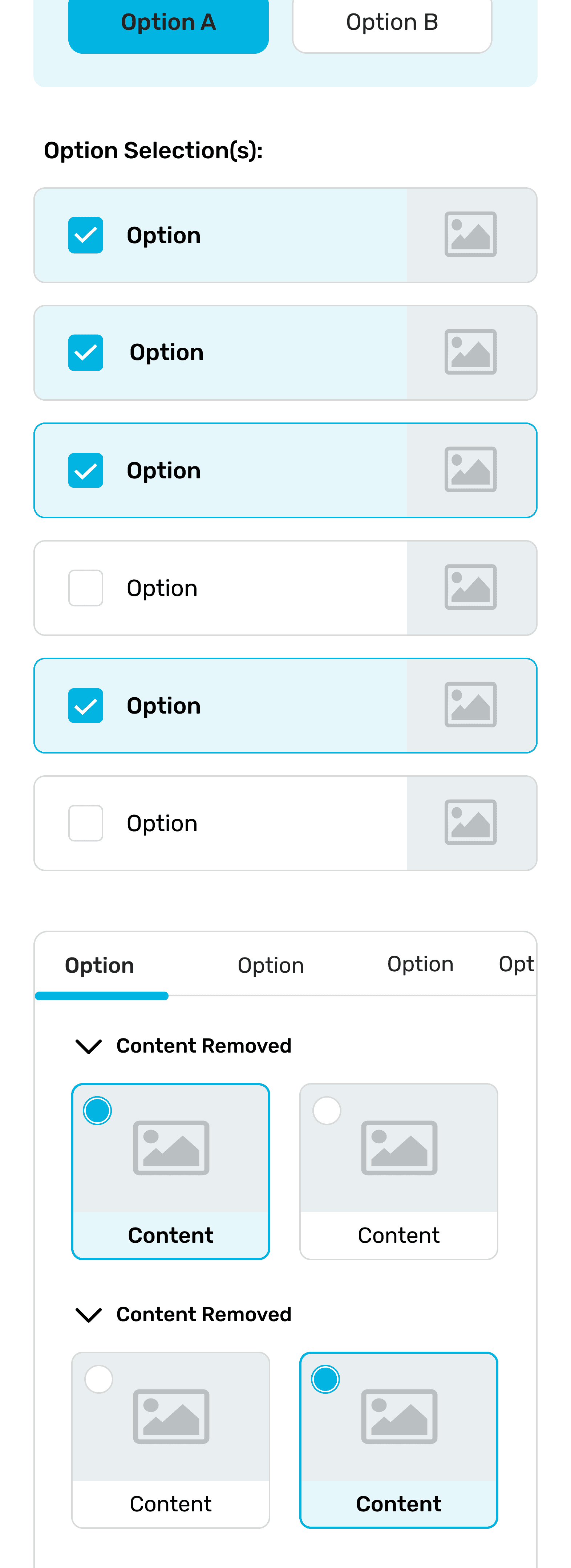
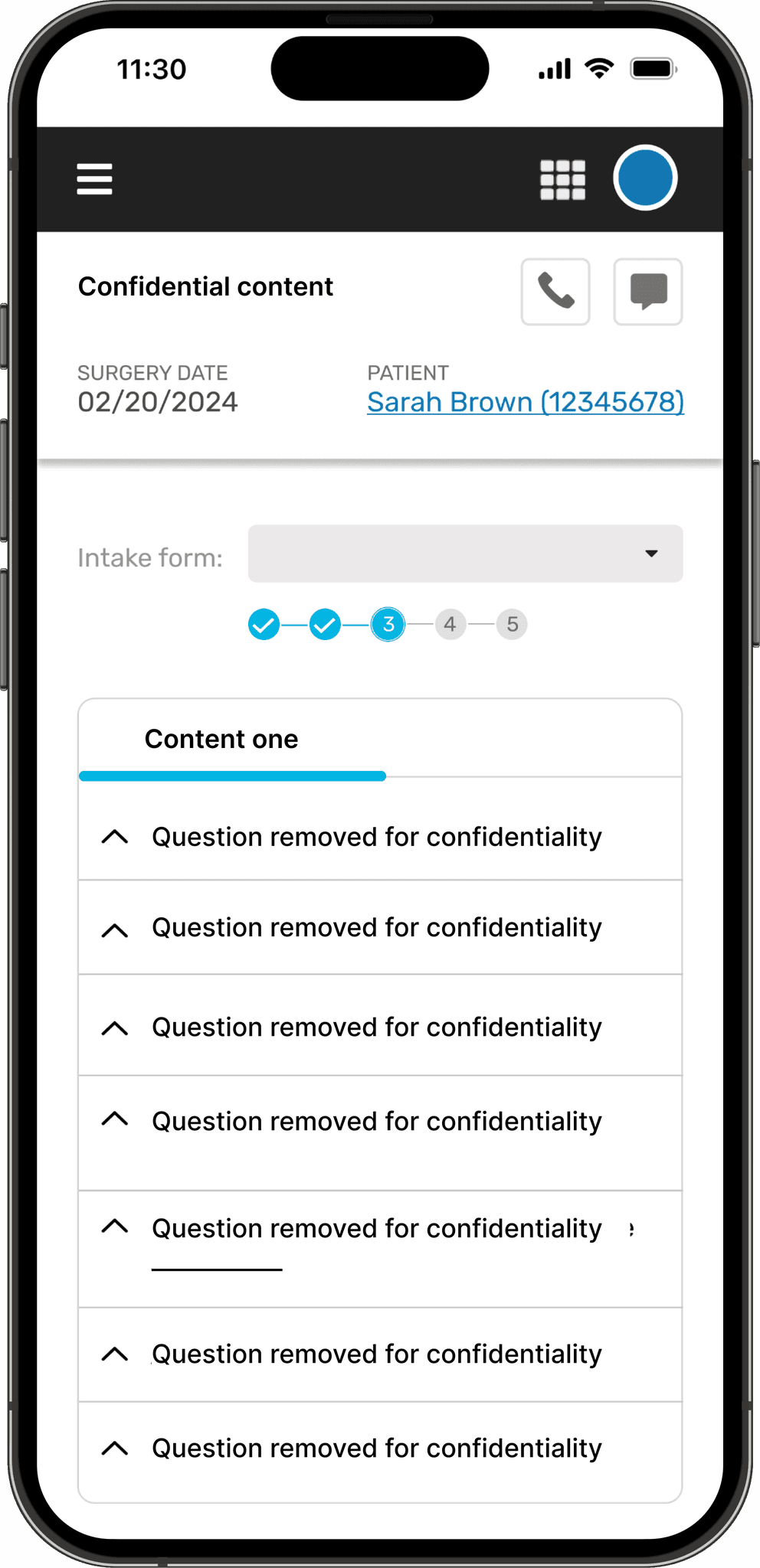
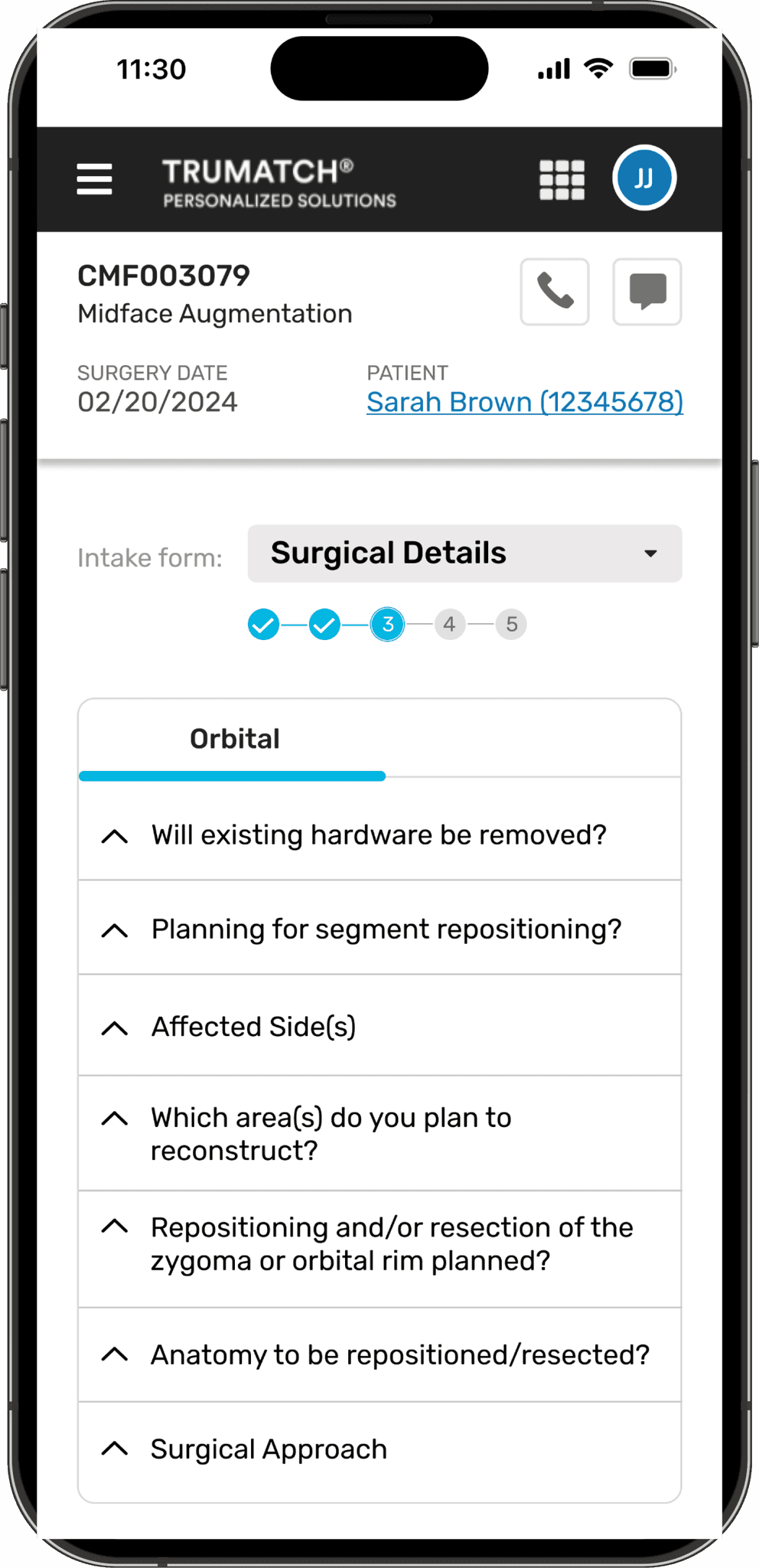
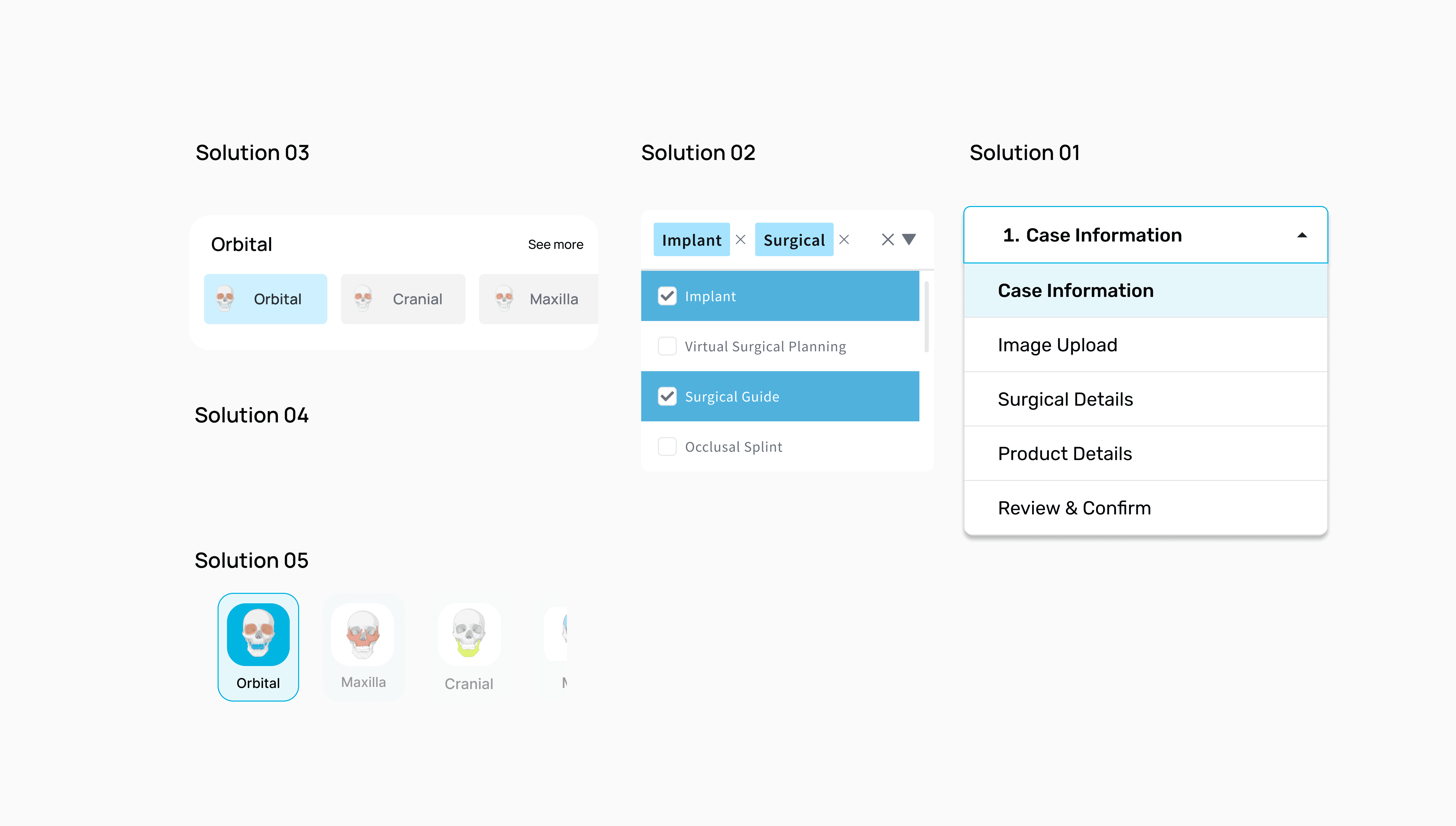
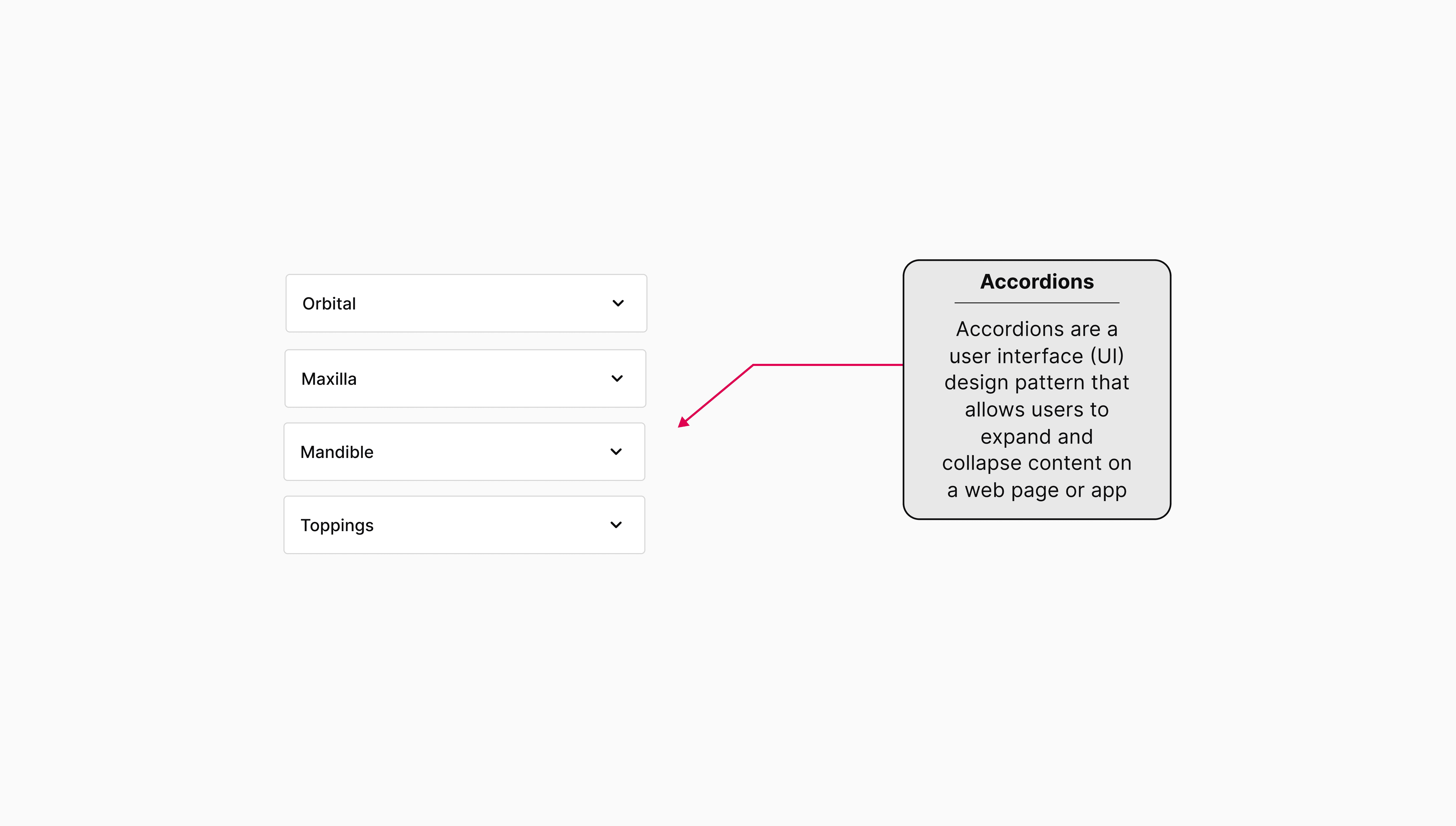
To address the problem, I came up with multiple solutions like accordions, pictorial representations, tabular formats, and drop-down menus to enhance usability and ensure a more intuitive navigation experience.
To address the problem, I came up with multiple solutions like accordions, pictorial representations, tabular formats, and drop-down menus to enhance usability and ensure a more intuitive navigation experience.
Solution Proposed
Solution
Proposed
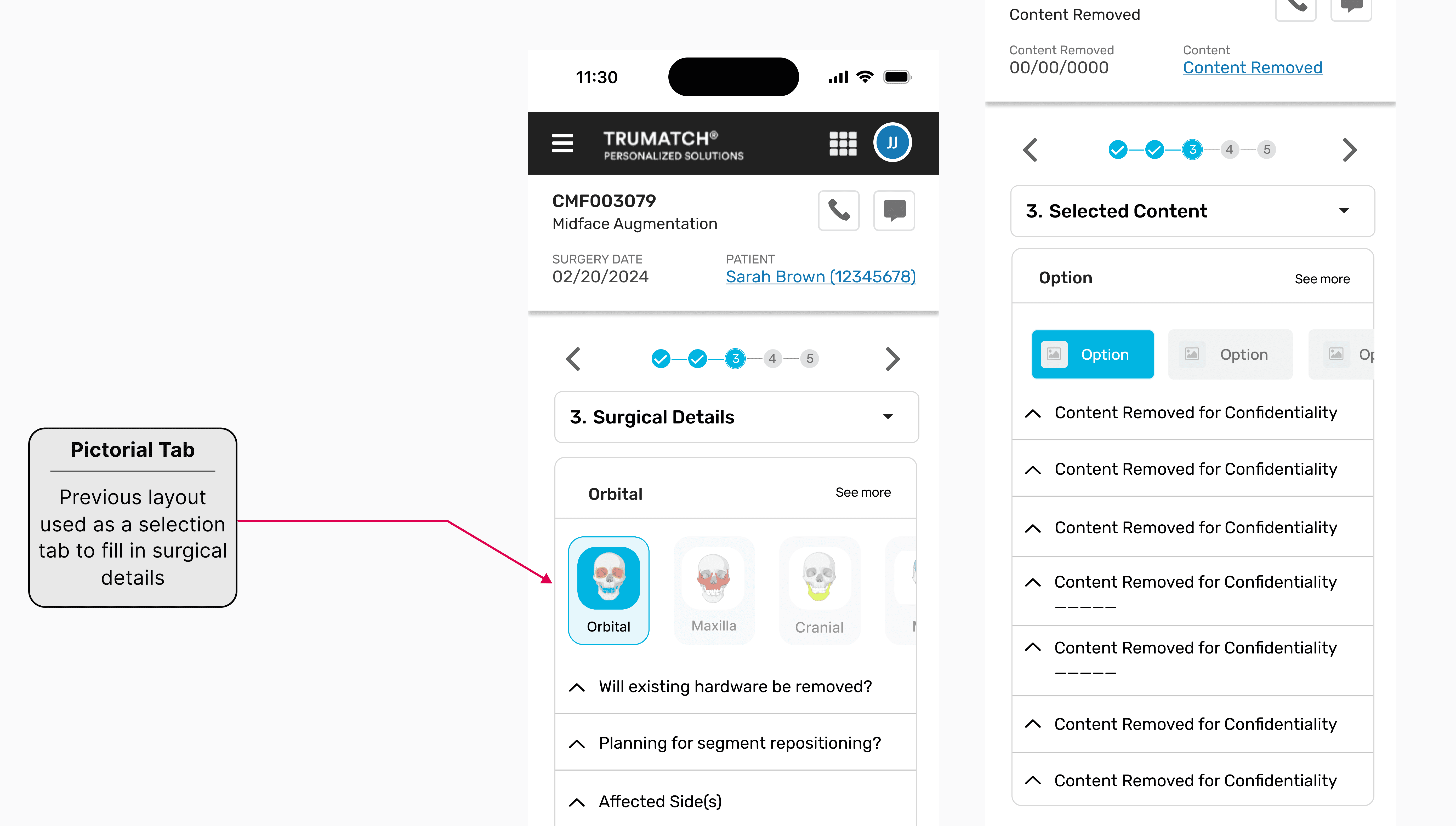
I thought using pictorial options would visually relate back to the original form layout, making it an intuitive and effective selection method.
Previous layout used as a selection tab to fill in surgical details
I thought using pictorial options would visually relate back to the original form layout, making it an intuitive and effective selection method.
Previous layout used as a selection tab to fill in surgical details
Pictorial Exploration
Pictorial Exploration
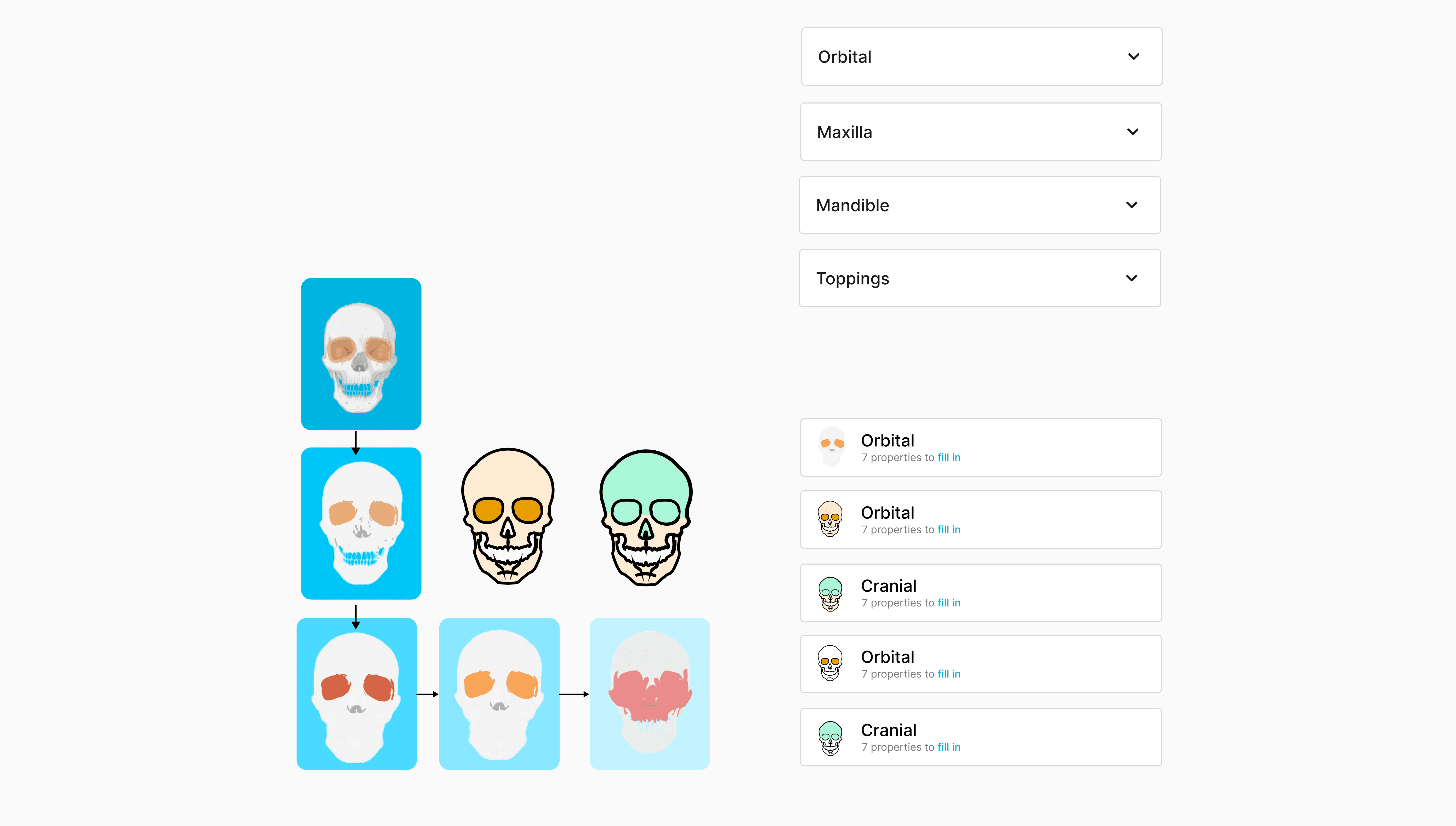
Over here, I explored iconography with Photoshop and Illustrator to test specific words. However, testing revealed that our target audience already understood the terminology, making visual cues redundant.
Over here, I explored iconography with Photoshop and Illustrator to test specific words. However, testing revealed that our target audience already understood the terminology, making visual cues redundant.
Simplifying Through Familiarity
By understanding the users' familiarity with the content, I refined the design to focus on clarity and simplicity, avoiding unnecessary elements that could distract from the core experience. This decision streamlined the interface, ensuring it remained intuitive and efficient for the surgeons using it.
Simplifying Through Familiarity
By understanding the users' familiarity with the content, I refined the design to focus on clarity and simplicity, avoiding unnecessary elements that could distract from the core experience. This decision streamlined the interface, ensuring it remained intuitive and efficient for the surgeons using it.
Prototyping
Prototyping
My role involved extensive prototyping, ensuring that all the accordions I suggested earlier function properly making a significant impact in the user experience
Challenges
Thorough communication - Clare and Khusboo using Figma comments
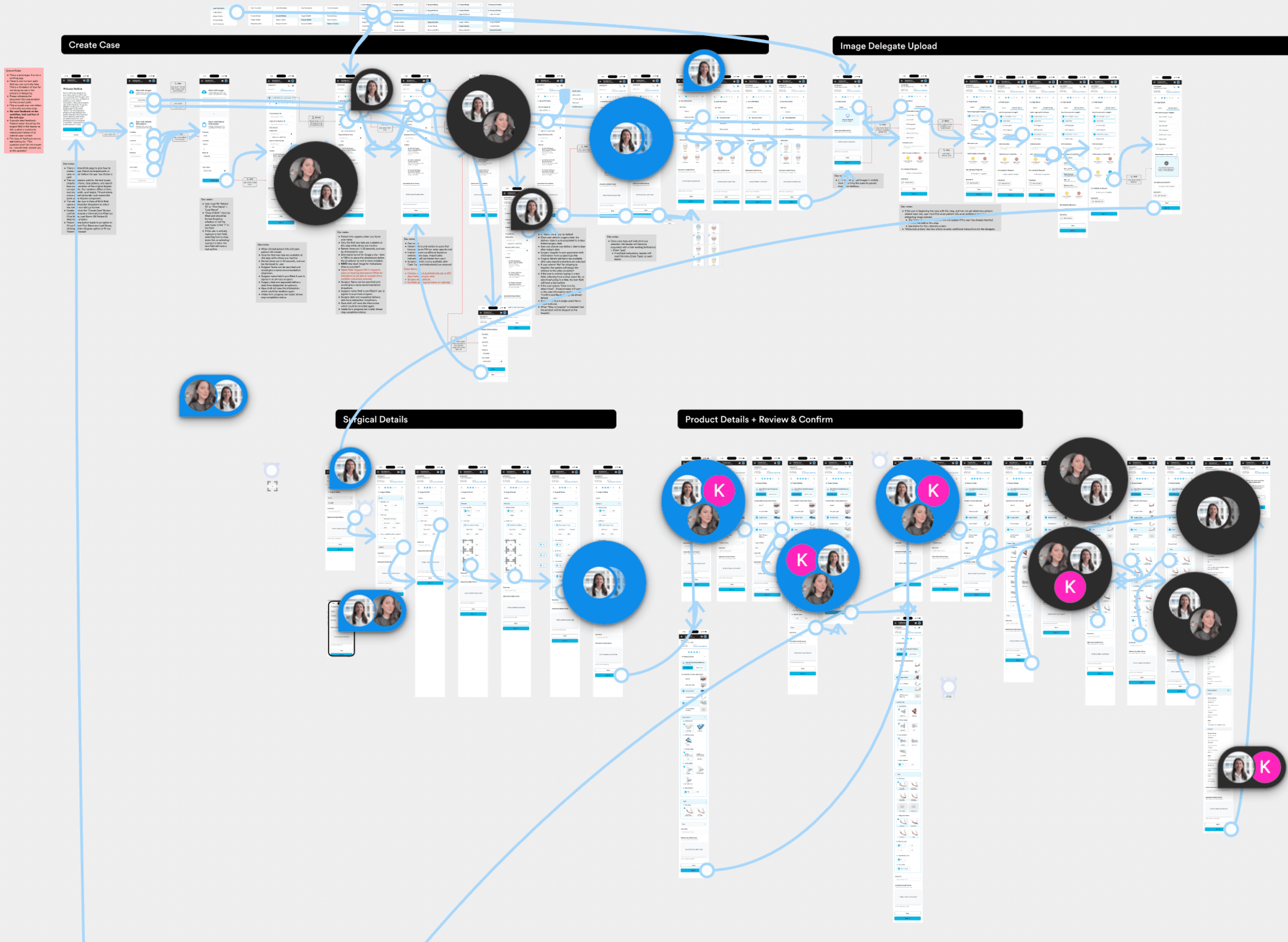
I Watched youtube videos to refine the use of variants, assets and techniques
My role involved extensive prototyping, ensuring that all the accordions I suggested earlier function properly making a significant impact in the user experience
Challenges
Thorough communication - Clare and Khusboo using Figma comments
I Watched youtube videos to refine the use of variants, assets and techniques
Variant Methods
Variant Methods
Discover's brand voice resonates with boldness, imagination, and an insatiable appetite for new experiences. Through their designs, the team endeavors to encapsulate the essence of adventure and evoke a sense of wanderlust in the audience.
Discover's brand voice resonates with boldness, imagination, and an insatiable appetite for new experiences. Through their designs, the team endeavors to encapsulate the essence of adventure and evoke a sense of wanderlust in the audience.
Final prototyping
Final prototyping
My tasks were mostly based on finding design solutions for specific features in a unique experience.
Jump into a new product, understand how it works with it’s respective target audience
Making sure the solutions match the existing design system and limitations
Integrating interaction through figma’s prototyping
My tasks were mostly based on finding design solutions for specific features in a unique experience.
Jump into a new product, understand how it works with it’s respective target audience
Making sure the solutions match the existing design system and limitations
Integrating interaction through figma’s prototyping
Intake Flow
Intake Flow
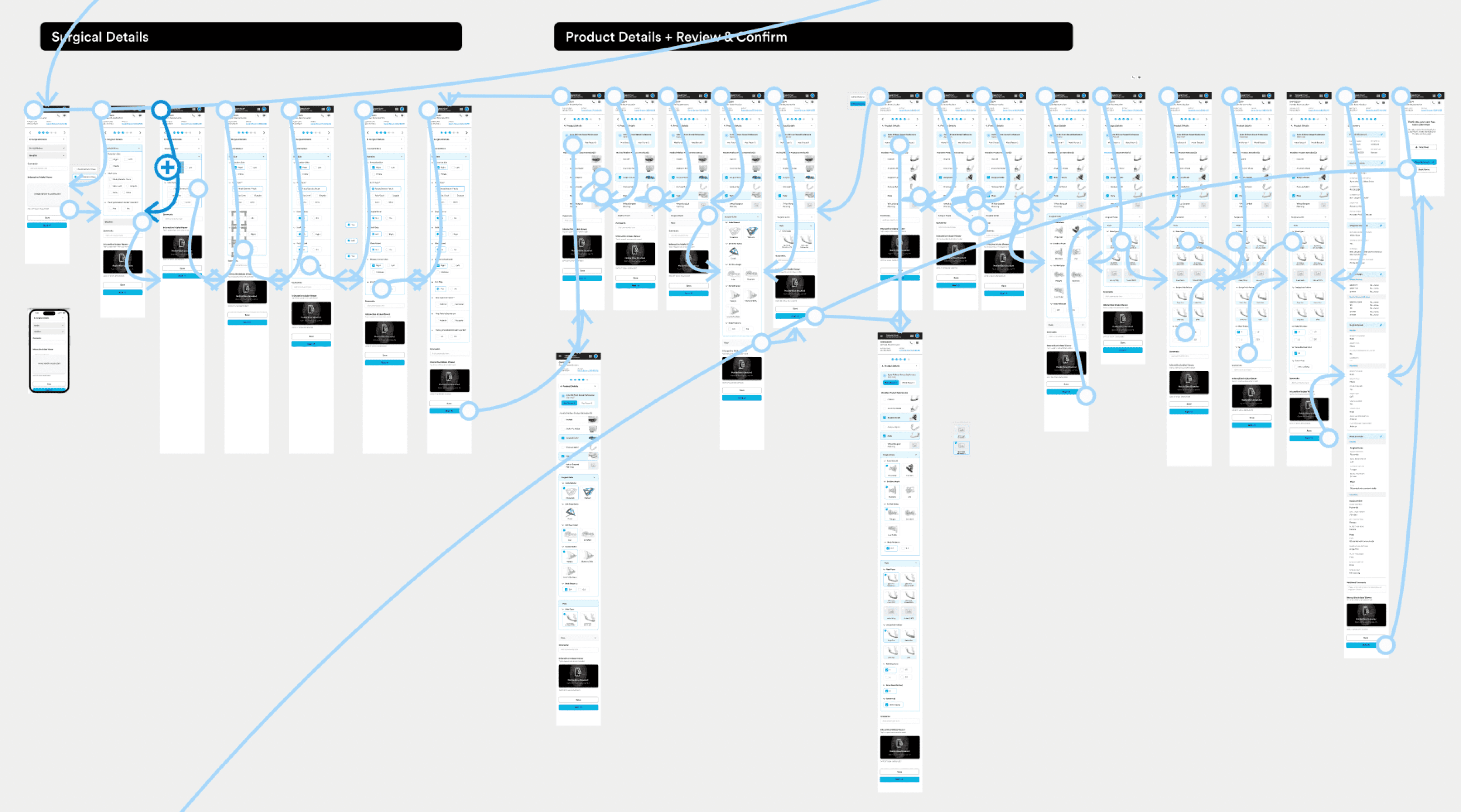
By reducing the number of frames, I streamlined the user interaction, allowing for a more linear and intuitive flow with no back-and-forth between functions. This approach ensured that the prototype maintained its stability, eliminating glitches and providing a smoother, more reliable user experience.
By reducing the number of frames, I streamlined the user interaction, allowing for a more linear and intuitive flow with no back-and-forth between functions. This approach ensured that the prototype maintained its stability, eliminating glitches and providing a smoother, more reliable user experience.
Usability Testing
Usability Testing
My tasks were mostly based on finding design solutions for specific features in a unique experience.
Jump into a new product, understand how it works with it’s respective target audience
Making sure the solutions match the existing design system and limitations
Integrating interaction through figma’s prototyping
My tasks were mostly based on finding design solutions for specific features in a unique experience.
Jump into a new product, understand how it works with it’s respective target audience
Making sure the solutions match the existing design system and limitations
Integrating interaction through figma’s prototyping
Consent Form
Consent Form
The current process requires users to manually download and fill out forms, with each field highlighted in different colors. This approach not only adds unnecessary steps but also creates visual clutter, making it difficult to focus on the essential information.
4o
The current process requires users to manually download and fill out forms, with each field highlighted in different colors. This approach not only adds unnecessary steps but also creates visual clutter, making it difficult to focus on the essential information.
4o

Solutions Proposed
Solutions Proposed
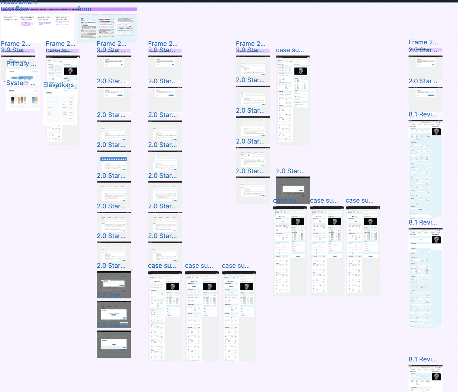
To address this, I proposed three different solutions. I integrated these ideas into a prototype and tested various positions within the form's intake flow. After evaluating their effectiveness by user testing and stakeholder's feedback, I narrowed down the selection to the most efficient solution, streamlining the form-filling process.
To address this, I proposed three different solutions. I integrated these ideas into a prototype and tested various positions within the form's intake flow. After evaluating their effectiveness by user testing and stakeholder's feedback, I narrowed down the selection to the most efficient solution, streamlining the form-filling process.
Final Prototyping
This Digital version of the form is not only interactive, but also highlights the important fields such as reporting company, procedure type giving users direct indication of their chosen fields. There is less clutter as all fields aren’t highlighted at the same time and at the same time it fulfils the purpose.
Final Prototyping
This Digital version of the form is not only interactive, but also highlights the important fields such as reporting company, procedure type giving users direct indication of their chosen fields. There is less clutter as all fields aren’t highlighted at the same time and at the same time it fulfils the purpose.
Team Building
Team Building
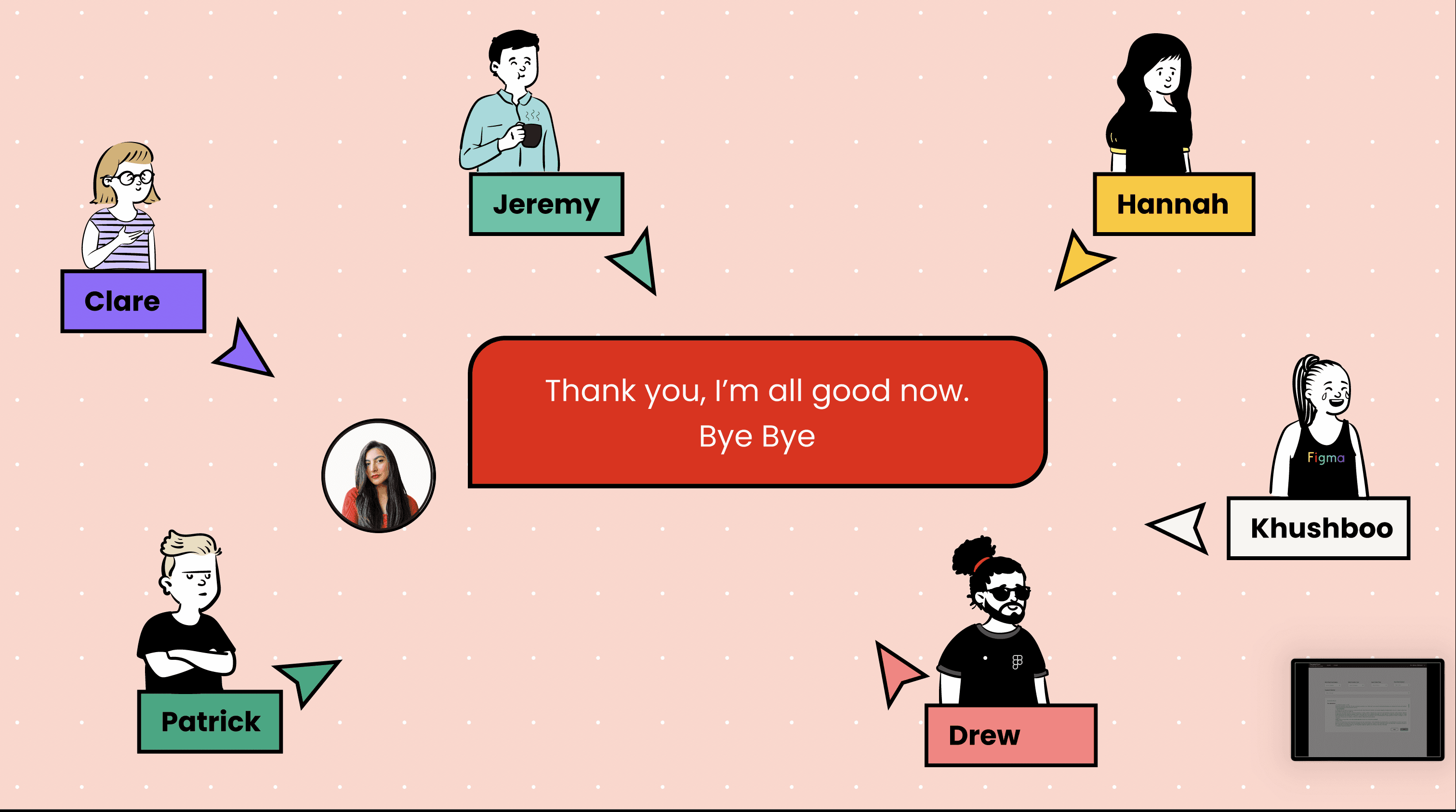
By the end of my co-op, I put together a presentation that celebrated each team member with illustrations. This experience significantly enhanced my UX skills, thanks to working with a diverse team and conducting usability testing with surgeons.
It was a transformative period that deepened my understanding of user needs and the impact of well-designed medical technology. The presentation is available upon request due to NDA restrictions—please contact me if you’d like access.
By the end of my co-op, I put together a presentation that celebrated each team member with illustrations. This experience significantly enhanced my UX skills, thanks to working with a diverse team and conducting usability testing with surgeons.
It was a transformative period that deepened my understanding of user needs and the impact of well-designed medical technology. The presentation is available upon request due to NDA restrictions—please contact me if you’d like access.